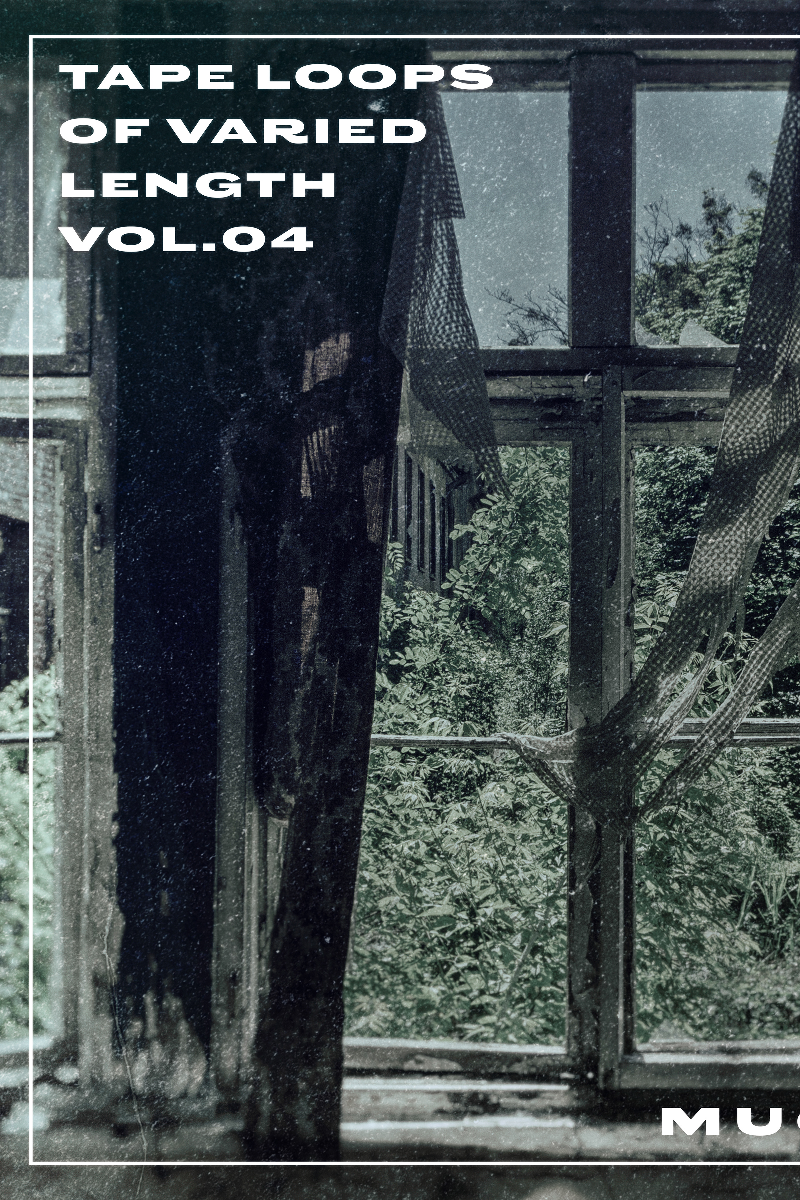
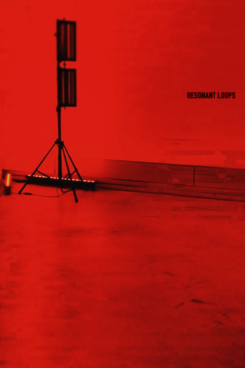
Let's start with the artwork for the cover…
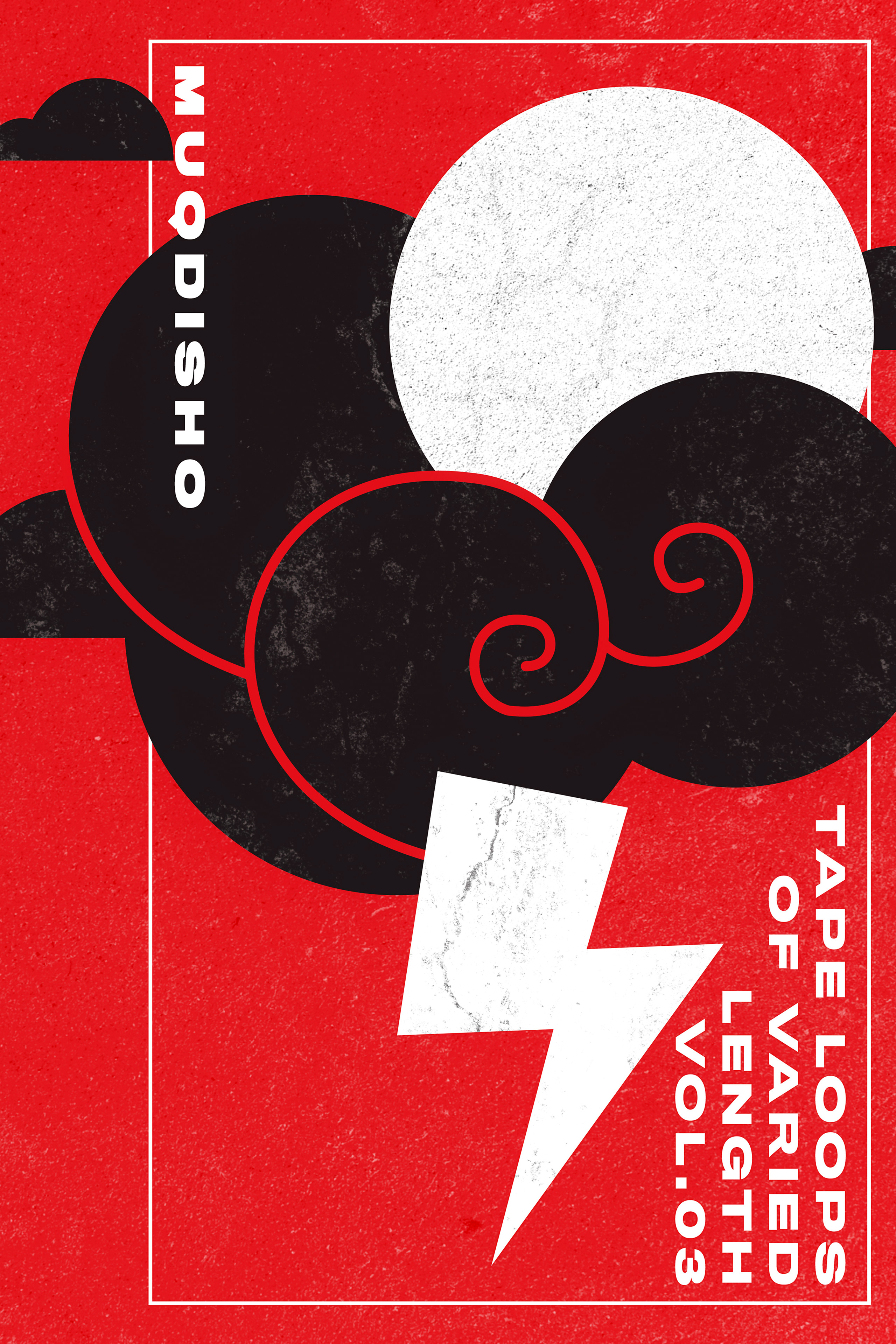
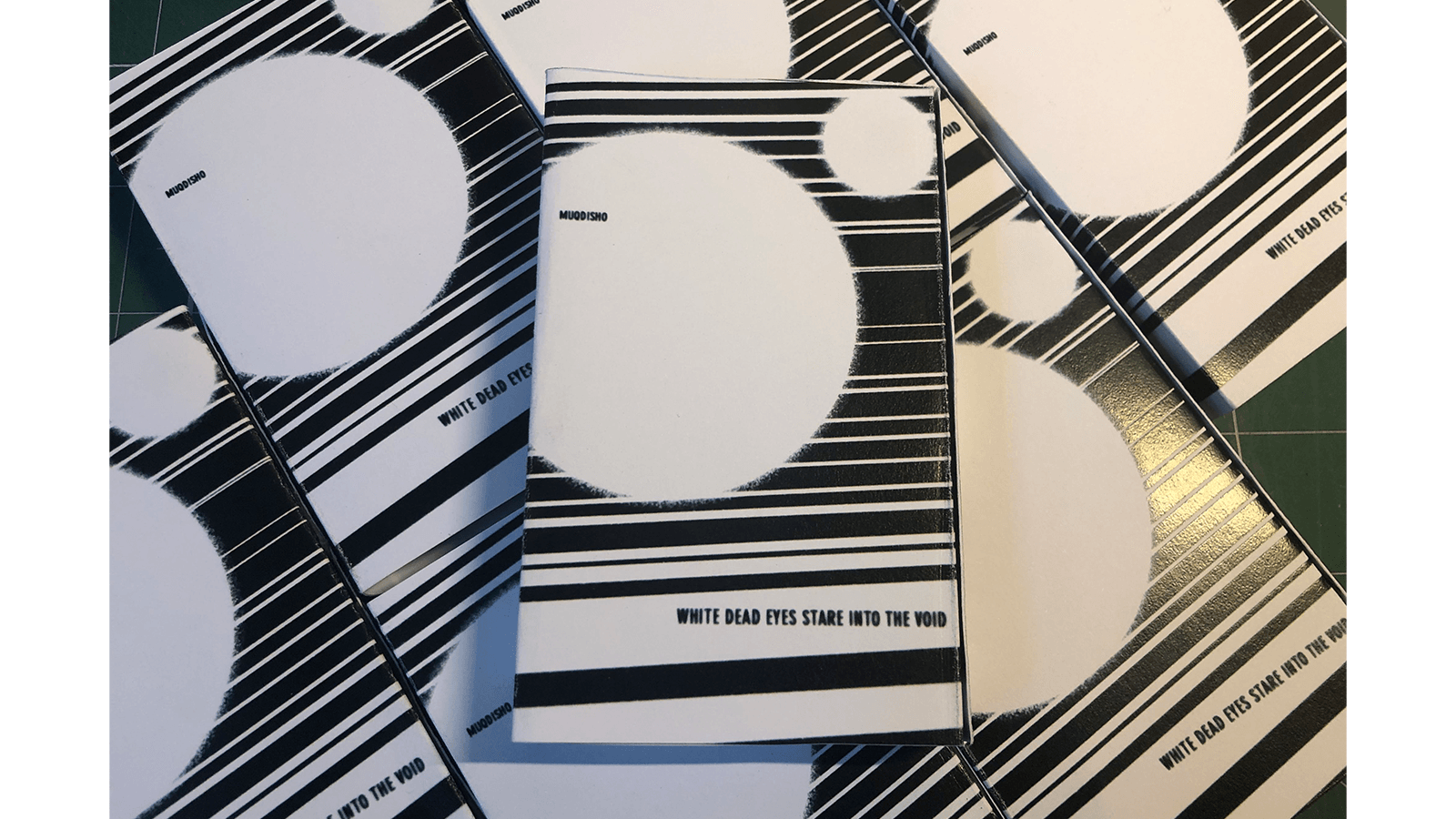
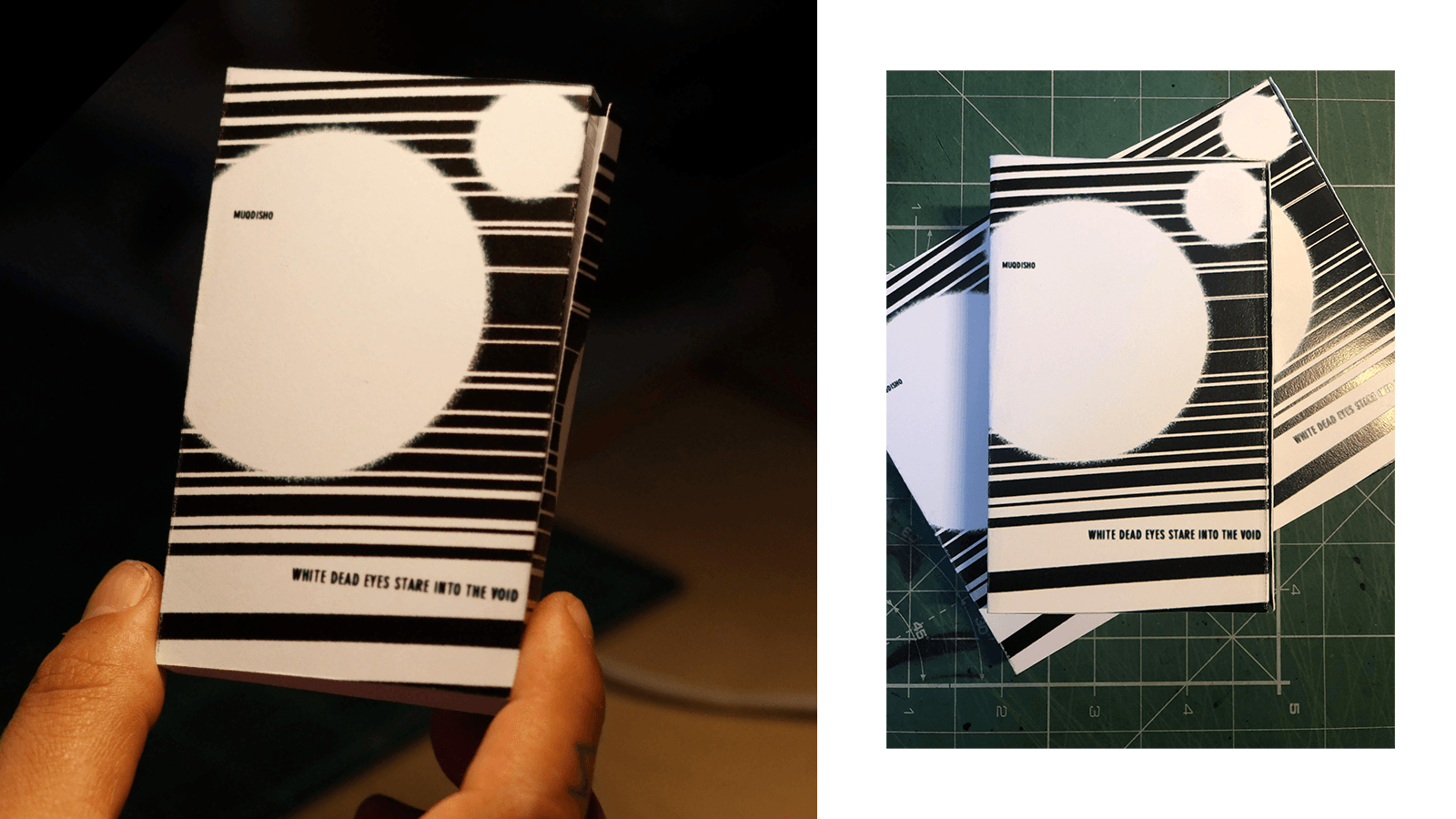
The album cover is, pretty much, the same when it comes to the digital and physical copies. The only difference is the shape of it since a cassette is a rectangle and not a square.
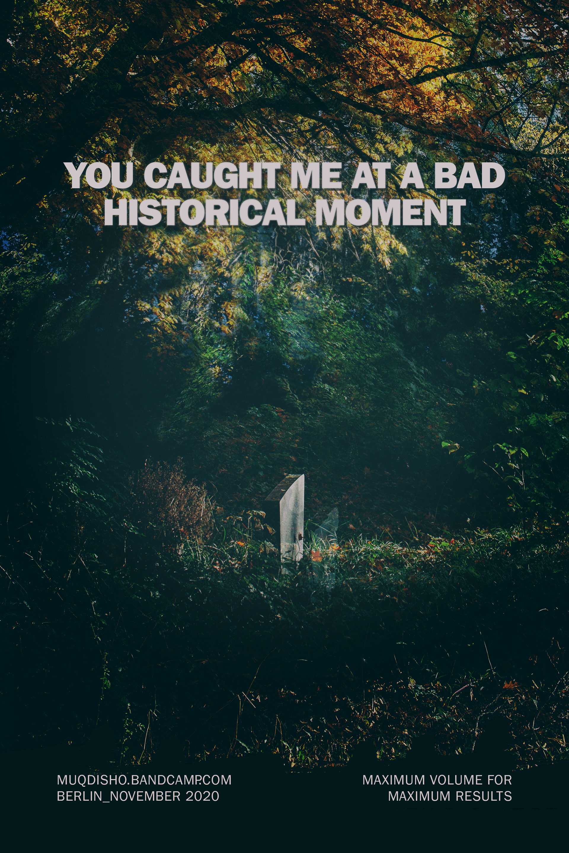
When it comes to the information available there, I decided to placed in a way that you need to flip the tape over so you can read the name of the tracks on the other side of the cover. Something simple but that I always liked to do when it comes to flyers.
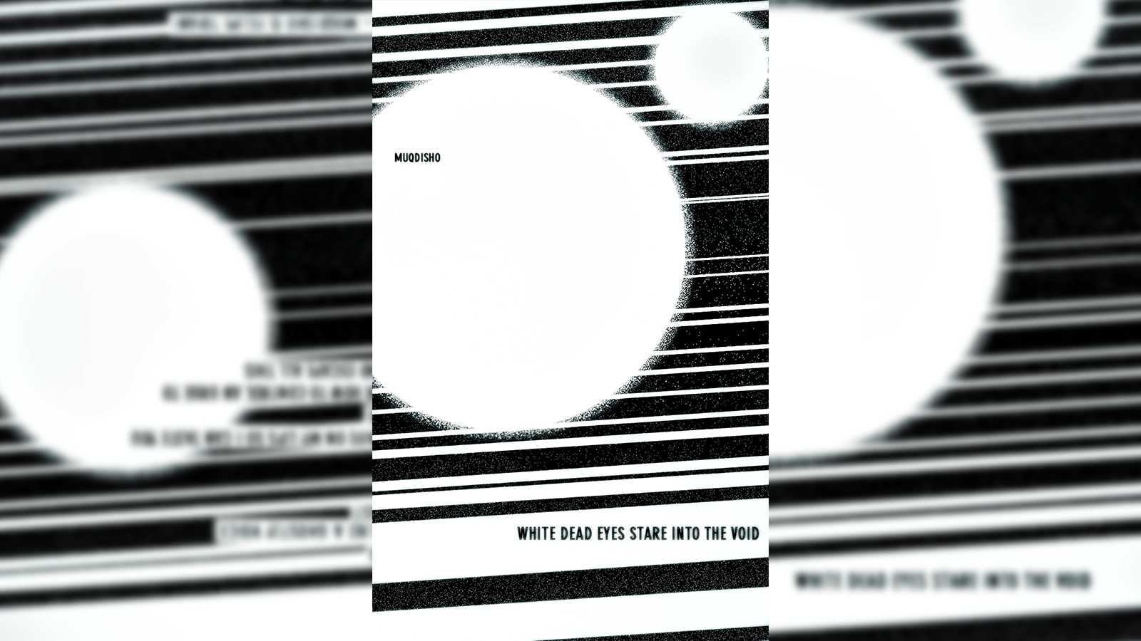
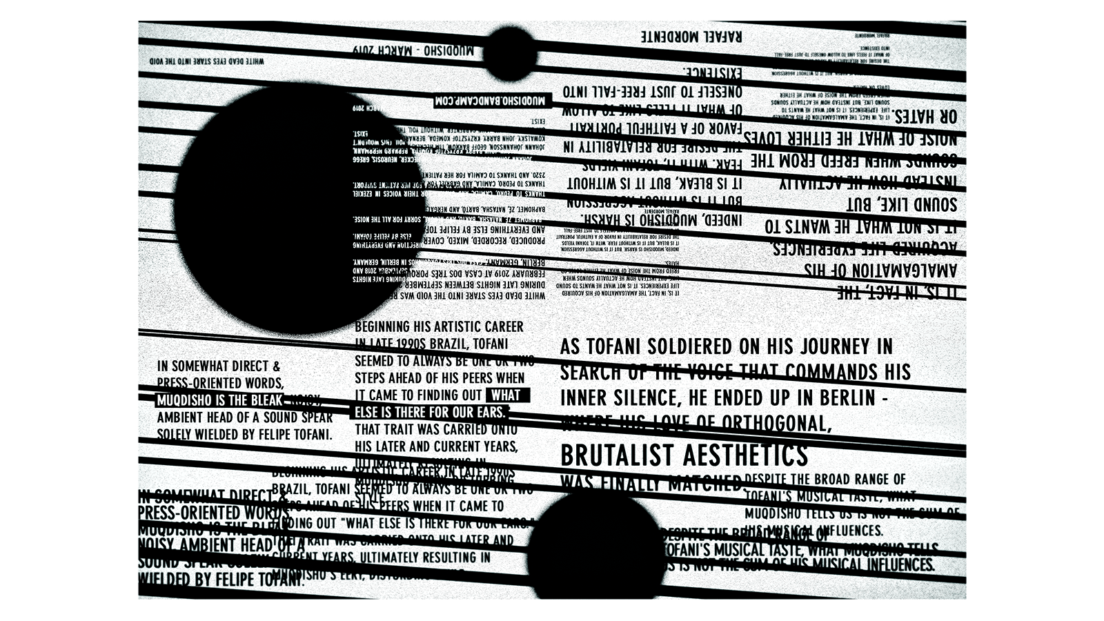
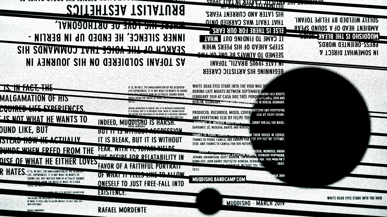
My favorite part of the process was to come up with the artwork for the booklet that comes with the cassette. Since muqdisho's music doesn't have any lyrics, I wanted to explore something a little bit different when it comes to the information printed there.
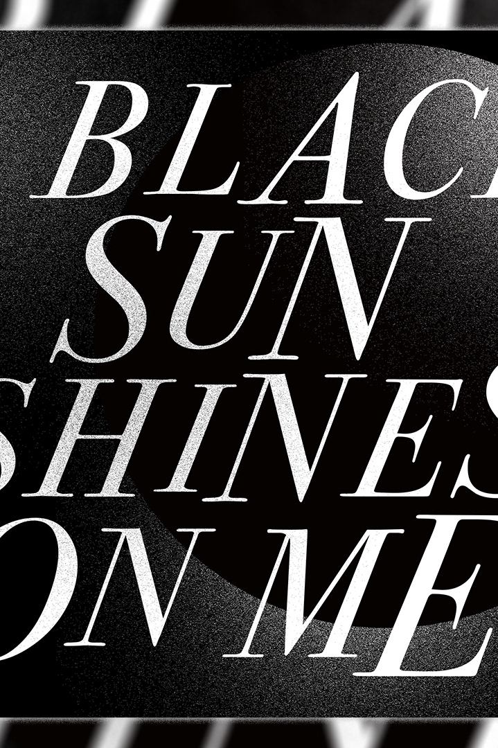
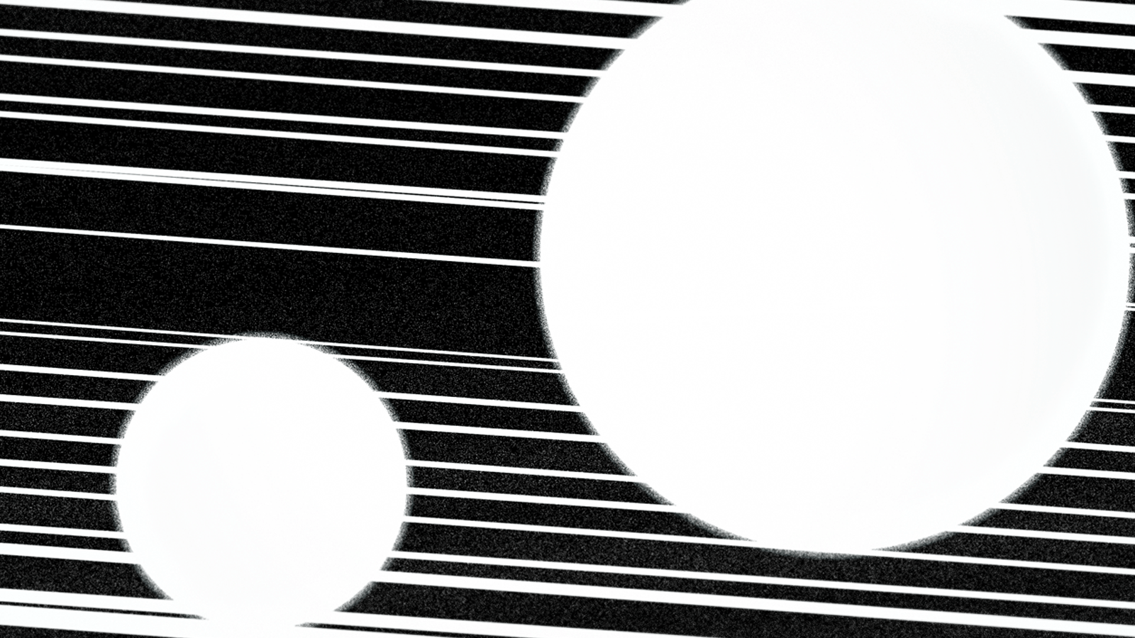
So, I decided to explore the release information written by Rafael Mordente. My goal was to make hard to read and emulate some of the feelings that I show in the music that I play. There is a lot of blurred text, over printing and everything looks messy at first but there is a concept behind.
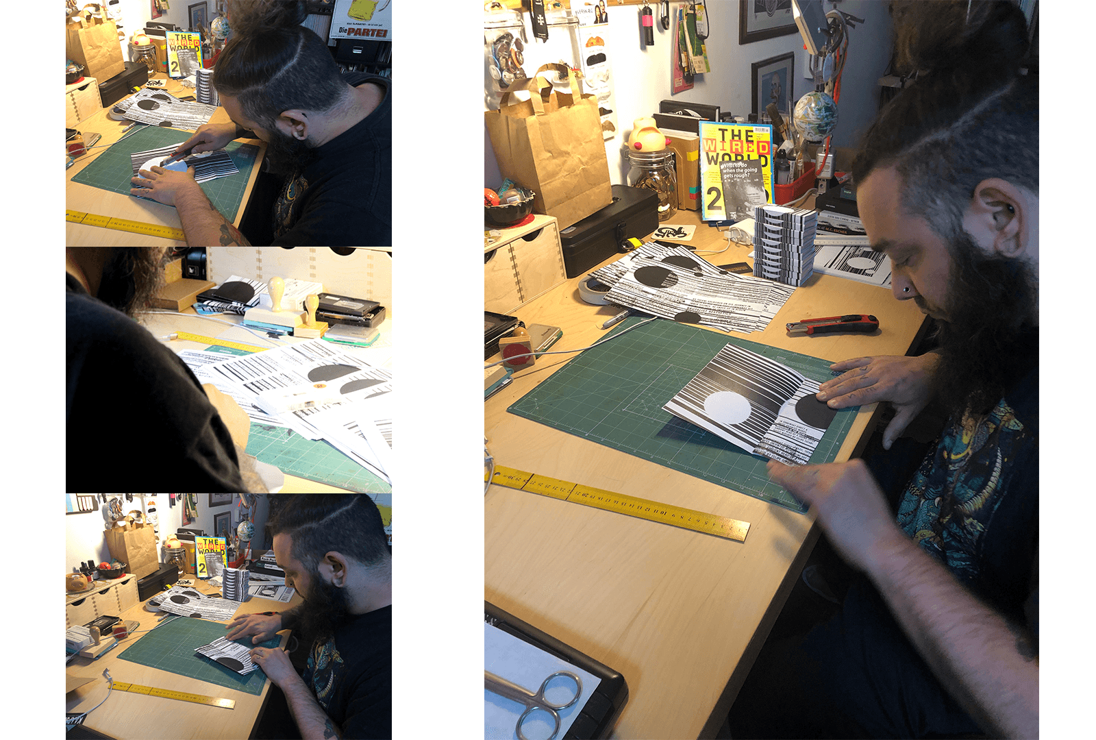
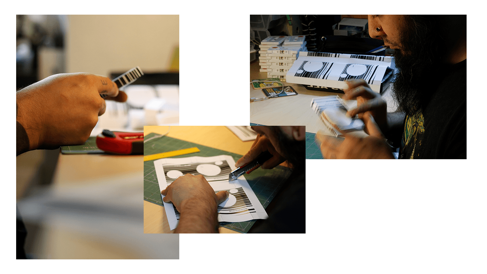
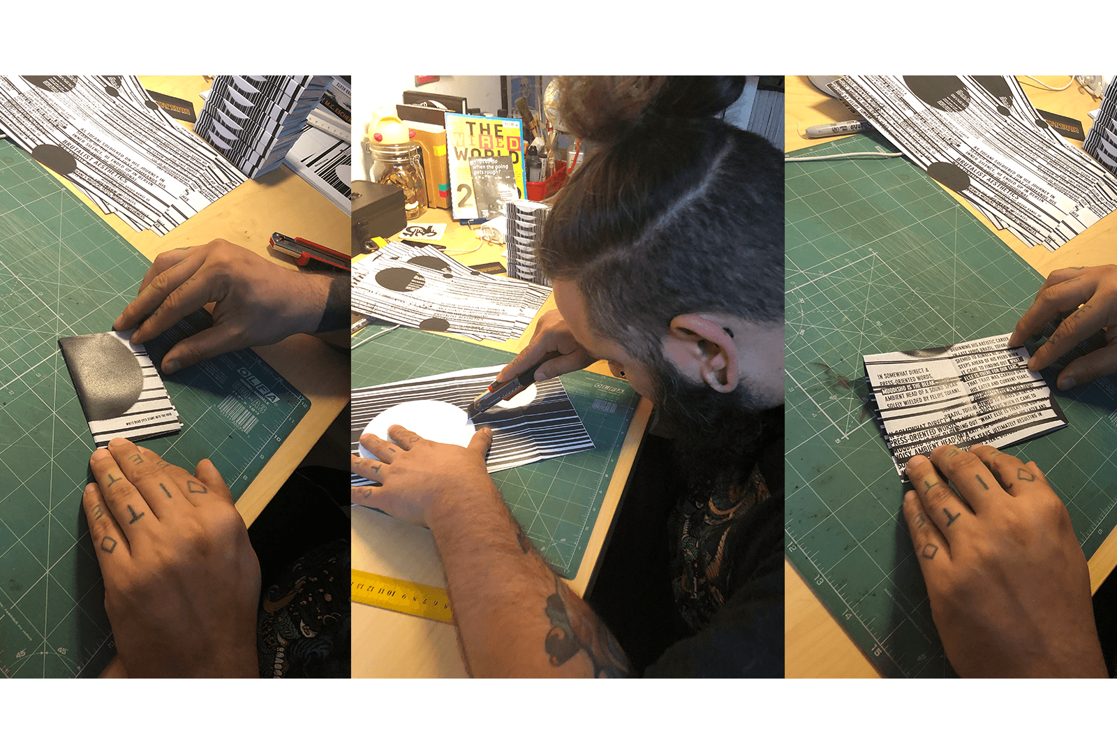
The hardest part was to fold and cut everything in the right way. But, at the same time, this was part of the challenge since most of my work and my music only exists digitally, I wanted to take the time and effort and go for something physical. Something that you can touch and play on your old school walkman. If you still have one of those laying around.
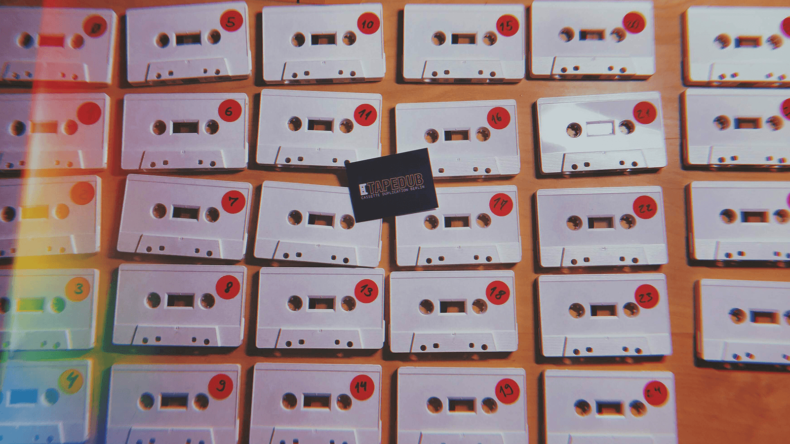
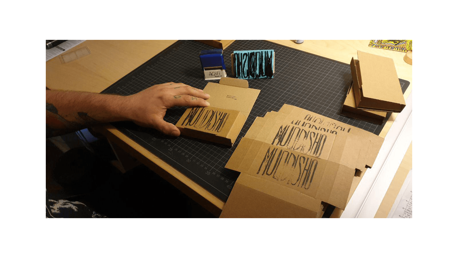
This is a limited series of 27 tapes, hand numbered and with the DIY spirit in everything. From the labels to the design and the production of everything.
But to give it a more unique style, I decided to carve a stamp with the name I use as a musician and stamp it on every cardboard box. My idea here was to explore how each person is going to sense the music in a different way. The same way that each stamp will print muqdisho differently.
If you liked what you saw here and want to grab a copy of the tape, click on the link below and buy yourself a copy.